I have a problem. I love the variety of shades that come out of indie makeup companies. Indies are a great and relatively inexpensive way to sample colors that you might not ordinarily try, and these companies consistently put out some of the most innovative hues on the market. Some of my favorite eye shadows are made by the likes of Fyrinnae and Darling Girl Cosmetics.
The downside is that these shadows generally come loose, in little plastic jars (that often don’t close tightly), and I always manage to spill them when I open them. It’s just a whole lot of mess! So I tend not to use them as often as I might want.
One day, I came across a beauty blogger who had pressed her loose shadows and pigments into pans, and I did some searching to find a recipe for how to do it myself. For all intents and purposes, I mostly used Mai’s wonderful tutorial. I bought a to-go Z Palette from Makeup Geek to house my creations, and pans and pressing supplies from TKB Trading. Overall, the supplies to make my palette cost about $25 plus shipping, not including the stockpile of loose shadows I already owned.

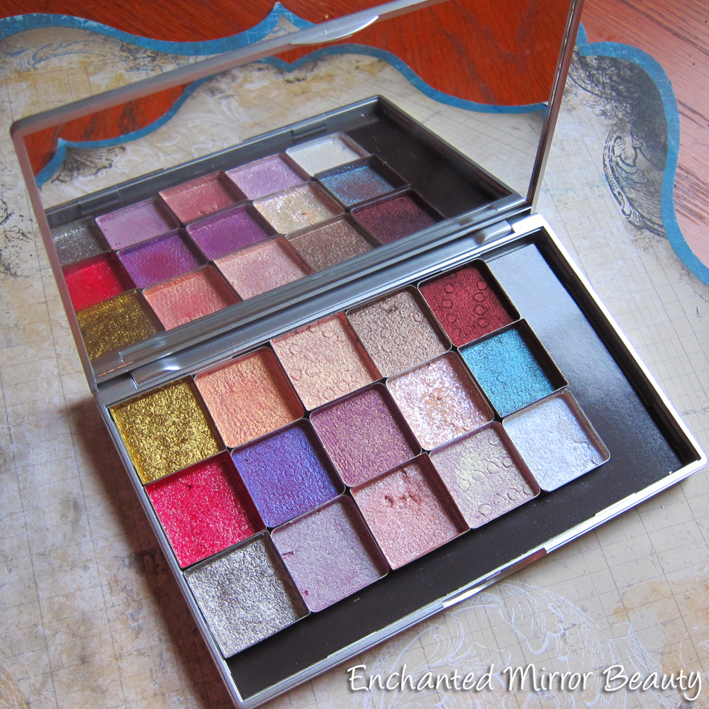
Z-Palette To Go
Here’s the size of the palette with my hand for reference. It feels very solid and secure, closes magnetically, and includes a large, easy to clean mirror. It was $12.99. If you use metal pans (or depot eyeshadow singles in metal pans), they will magnetically stay in place with no sliding. If you use plasticized pans, both Makeup Geek & TKB sell stick-on magnets for the back.
A thing I learned while pressing: most of the shadows I had were petites or generous samples that measured about 1/4 tsp. Since that juuuuust barely covered the bottom of the pan, I’d suggest pressing shadows where you have 1/2 – 3/4 tsp’ worth of powder to work with.
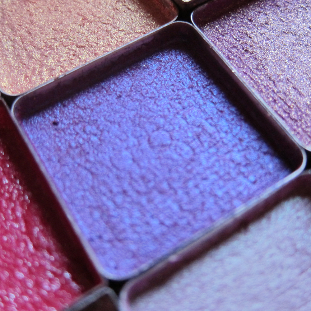
Now, for some close-ups of the shadows. The pattern you see on some is the pattern left over by the paper towel I used when tamping. TKB was out of the pressing ribbon stuff.

Top: 1. Aromaleigh: Gleam, 2. Fyrinnae: Rapunzel Had Extensions, 3: Aromaleigh: Amandier, 4. Fyrinnae: Witchy Woodland Creatures, 5. Fyrinnae: Mephisto.
Middle: 1. Aromaleigh: Vivelerock, 2. Darling Girl: Obviously A Wig, 3. Fyrinnae: Meerkat, 4. Darling Girl: Prometheus, 5. Persephone Minerals: Kalifa.
Bottom: 1. Aromaleigh: Psyche, 2. Fyrinnae: Herbivore, 3. Frankenstein Color, 4. Darling Girl: Hope, 5: Darling Girl: Buddy Blue.

Top: 1. Fyrinnae Rapunzel Had Extensions, 2. Darling Girl Obviously A Wig, 3. Fyrinnae Herbivore.
Bottom: 1. Aromaleigh Gleam, 2. Aromaleigh Vivelerock, 3. Aromaleigh Psyche.
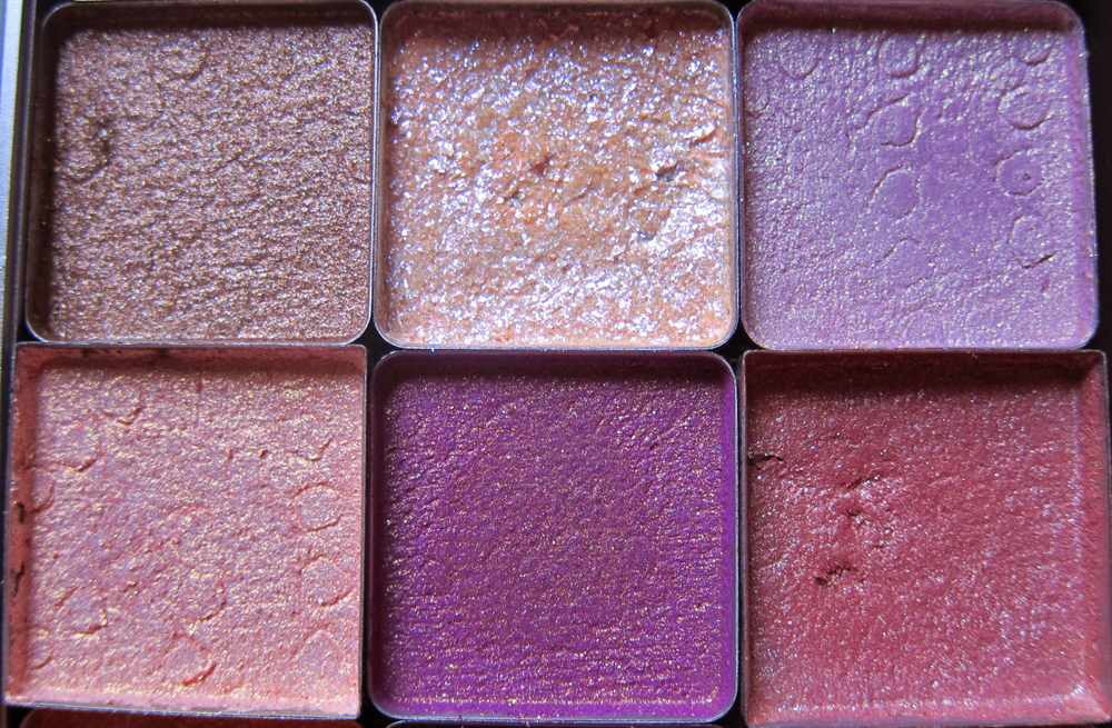
Top: 1. Fyrinnae: Witchy Woodland Creatures, 2. Darling Girl: Prometheus, 3: Darling Girl: Hope
Bottom: 1. Aromaleigh: Amandier, 2: Fyrinnae: Meerkat, 3: Frankenstein color
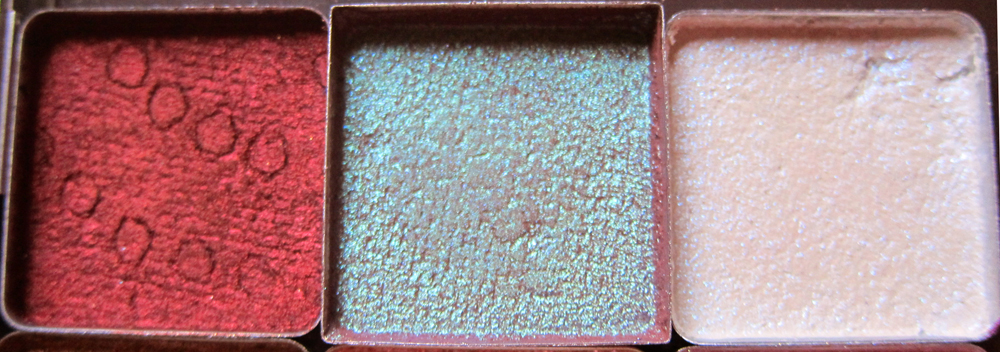
1. Fyrinnae: Mephisto, 2. Persephone Minerals: Kalifa, 3. Darling Girl: Buddy Blue.
Oooh, so pretty. But how did they stand up to the originals when it comes to pigmentation? The answer is that some translated better than others. Here are individual reviews of the shades.

Aromaleigh v1 – Discontinued Shade – Gleam (Original, Pressed)
We start with Gleam from Aromaleigh v 1. It’s a discontinued shade. It’s like liquid gold. The color stayed true here. That said, the flakier composition of the shade (it’s made up of tiny metallic flakes, not finely-milled powder) was brought out a bit when pressed. A very tiny difference, but worth noting.
Aromaleigh v1 – Discontinued Shade – Vivelerock (Original, Pressed)
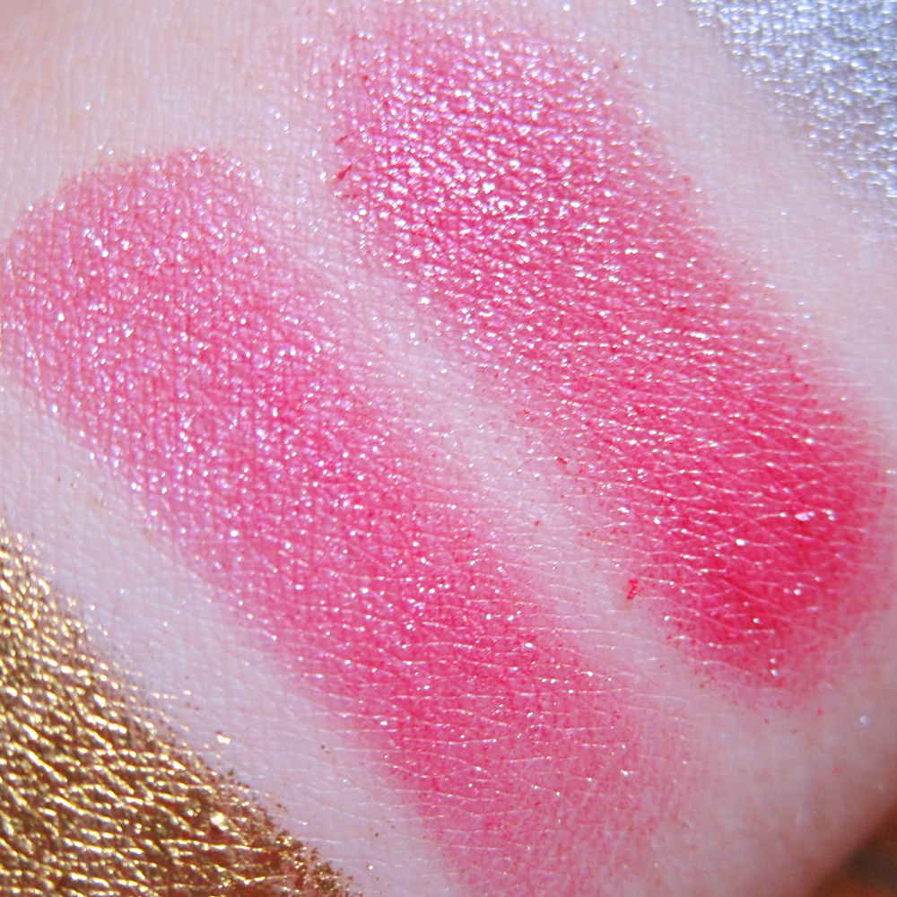
Another of the old Aromaleigh shades, from the discontinued Sonic Rocks collection. Vivelerock is a sparkly hot pink. The color survived intact.

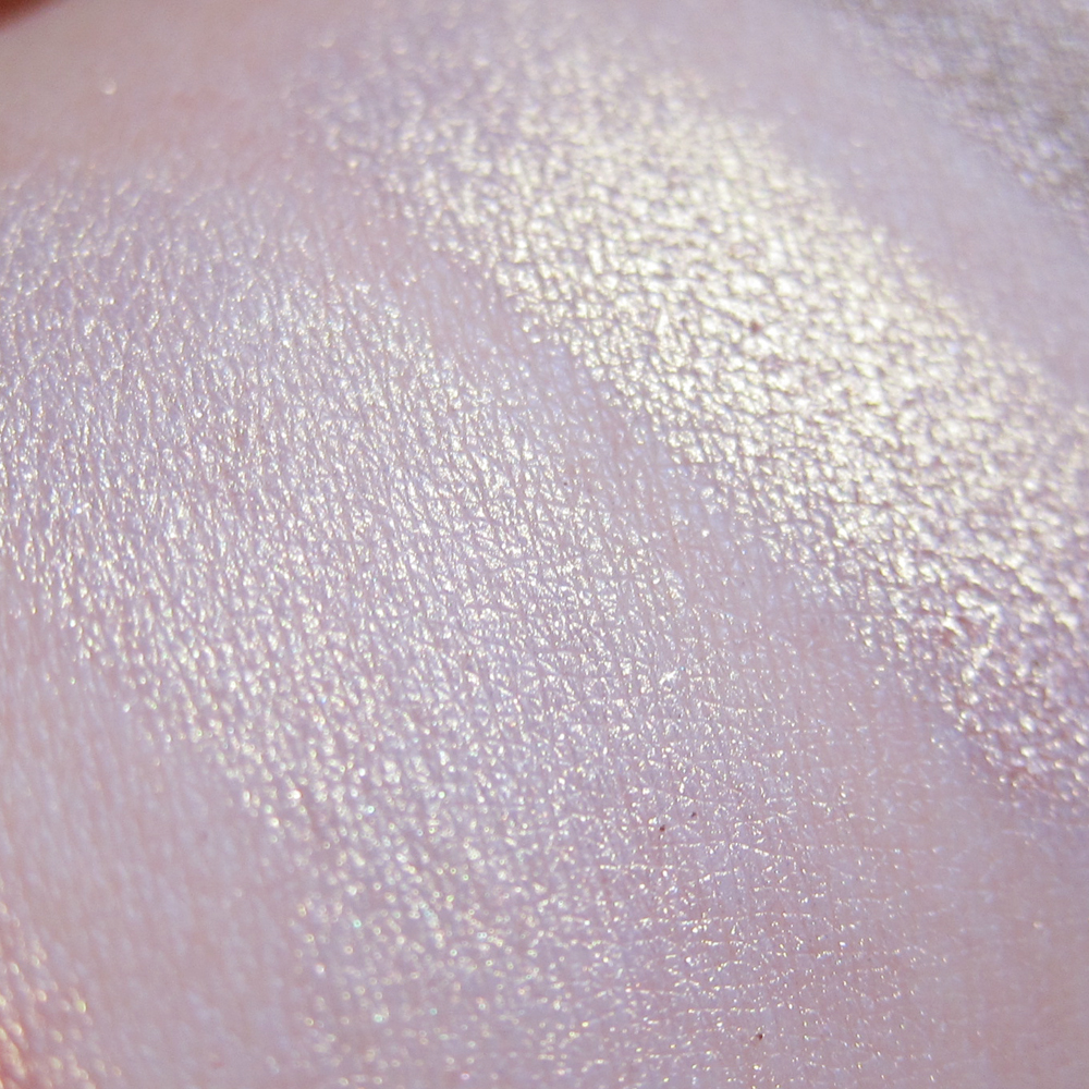
Aromaleigh v1 – Discontinued Shade – Psyche (Original, Pressed)
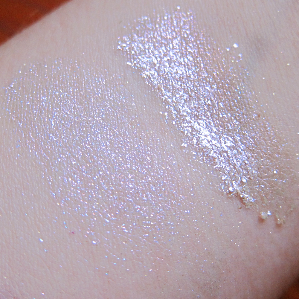
The final original Aromaleigh shade. Psyche is a true silver metallic. There was absolutely no change in texture nor color during pressing.
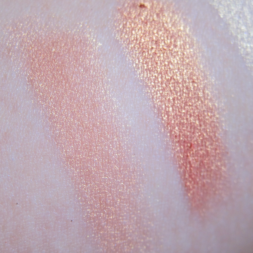
Fyrinnae – Rapunzel Had Extensions (Original, Pressed)
Fyrinnae’s Rapunzel Had Extensions is a peachy gold. It’s a stunner on me. Pressed, it looks like it does when foiled: mainly a bit darker and more pigmented. I liked this better pressed!
Aromaleigh v2 – Amandier (Original, Pressed)
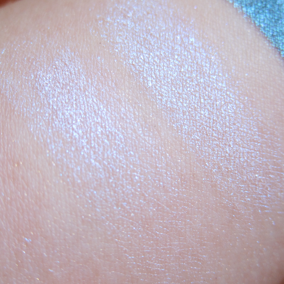
This is a new Aromaleigh shade, Amandier, which I’ll be reviewing more in-depth later this week. Suffice it to say I liked it enough that I bought it in full size just so I could press it. In the pan, it looks like a champagne shade. On my skin, it’s a lovely white gold, very similar to NARS Albatross, but not quite as chalky. The only difference after pressing was that more of the pinky-peach base came through as a duochrome, but it was not a significant difference. I am SO pleased that this pressed well.

Fyrinnae – Witchy Woodland Creatures (Original, Pressed)
Fyrinnae’s Witchy Woodland Creatures is a medium brown with pretty blue and green shimmer. It translated pretty exactly to pressed shadow.
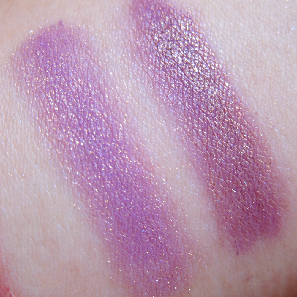
Darling Girl Cosmetics – Obviously a Wig (Original, Pressed)
Detail: Darling Girl Cosmetics – Obviously a Wig
Darling Girl’s Obviously a Wig morphed a lot during pressing. Loose, it’s a magenta with strong purple shift. Pressed, it was a dark violet. When swatched, though, the pressed version looked pretty much identical to how the loose powder applies when foiled– a magenta base with a strong blue-violet sheen.
Bonus: a mid-pressing pic. It was like all the magenta got pressed out with the excess alcohol!

Mid-press: Darling Girl Cosmetics Obviously A Wig
Weird!
Fyrinnae – Meerkat (Original, Pressed)
This is Fyrinnae’s Meerkat, a lilac with golden shimmer. The pressed version looks a tiny bit warmer, but just barely.

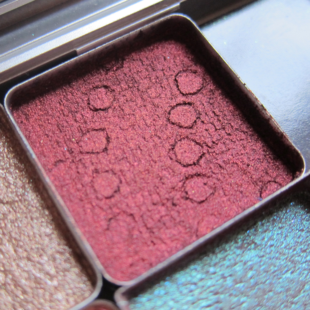
Detail: Darling Girl Cosmetics – Prometheus
Darling Girl Cosmetics – Prometheus (Original, Pressed)
This is Darling Girl Cosmetics’ Prometheus, a layering shade with iridescent sparkle. I have horrible fall-out with this one when I wear it loose, so I pressed it. Like Aromaleigh’s Gleam, this one is more of a flake than a finely-milled powder, as you can see in the close-up of the pan. It’s definitely more cohesive and less prone to fall-out when pressed, and looks as though it’s been foiled. It also takes a little more elbow grease to blend. So which version you prefer is likely to be a personal taste thing. In either case, loose or pressed, unless you want a soft lid wash, I’d recommend wearing it over a sticky base, like Pixie Epoxy.
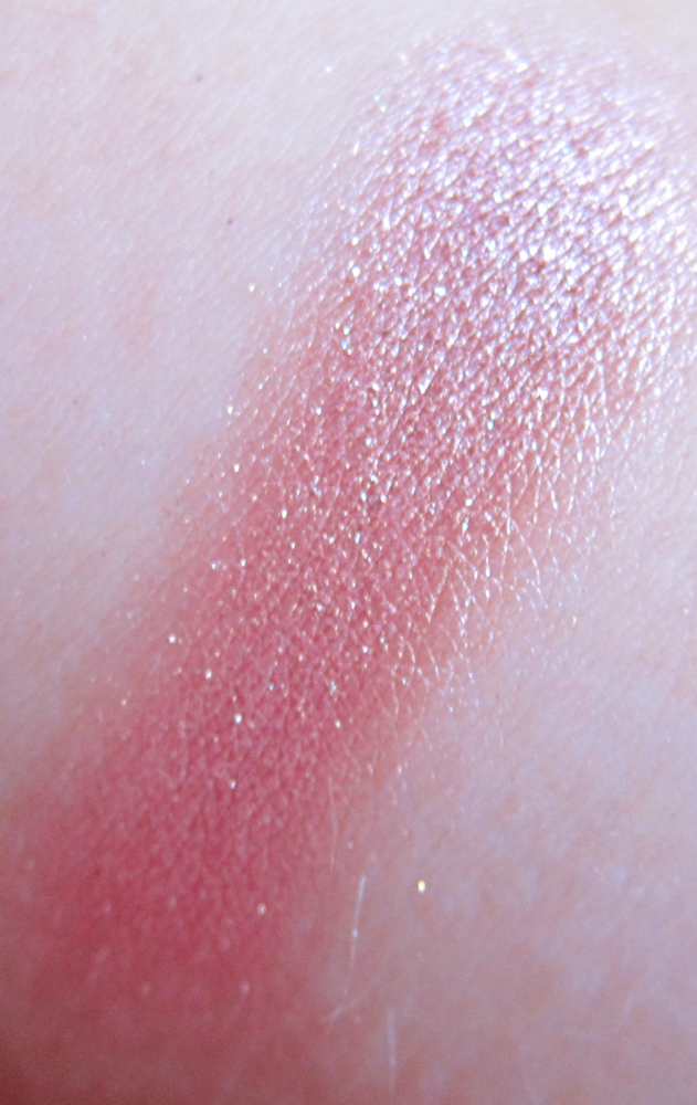
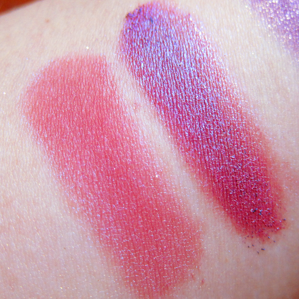
Frankenstein color! (Mixed from a bunch of samples.)
This is a Franken-shade I threw together from a bunch of samples. It’s a mauvey-pink frost with teeny blue microsparkles. It’s pretty!

Fyrinnae – Herbivore (Original, Pressed)
Fyrinnae’s Herbivore is a light lilac with strong green shimmer. It translated beautifully when pressed. It was another one that looked weird when I leeched the excess alcohol out. Look at this!

Mid-press: Fyrinnae Herbivore
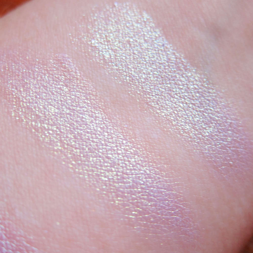
Darling Girl Cosmetics – Hope (Original, Pressed)
Darling Girl’s Hope is a lighter, more green-shimmer-heavy cousin to Herbivore. It looks great layered. It pressed wonderfully.

Bottom: Fyrinnae- Herbivore (Original, Pressed). Top: Darling Girl Cosmetics – Hope (Original, Pressed)
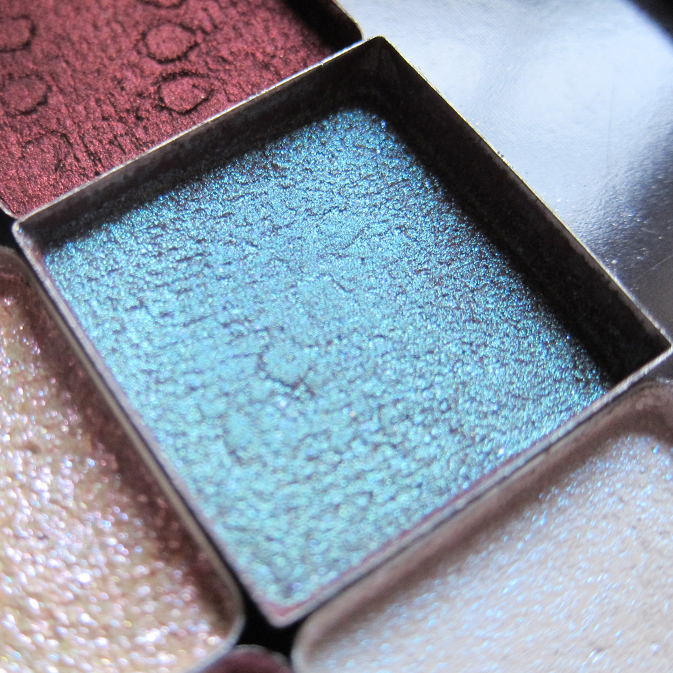
Darling Girl Cosmetics – Buddy Blue (Original, Pressed)
This is Darling Girl’s Buddy Blue, which is basically a blue interference highlight or layering shade. It pressed wonderfully, and actually applies better and more evenly when pressed!

Persephone Minerals – Kalifa (original sample)
Detail: Persephone Minerals – Kalifa

Persephone Minerals – Kalifa (Original, Pressed)
This was an odd one! It’s Kalifa by Persephone Minerals, which is one of those blue-brown duochromes. In the pot, it’s a turquoise shimmer shade. Mid-press, it looked like melted chocolate! The aqua duochrome gradually came back as the pan dried, and eventually looked pretty close to the original sample. There’s no difference in the swatches, however.
The final shade I have to show you was the biggest morpher– Mephisto by Fyrinnae. Just check out the difference from the original shade to the pressed pan.

Fyrinnae – Mephisto Sample
Fyrinnae – Mephisto Sample
Detail: Fyrinnae – Mephisto
What a huge difference! In the pot, it’s a cobalt blue/ deep violet, with shimmery sparks. In the pan, it’s a copper that nearly looks red. Just look at how it looked mid-press!

Mid-press: Fyrinnae Mephisto
Now, I did this one mostly out of curiosity. Mephisto is one of the most unique shades I’ve ever seen. Unfortunately, it’s one of those shades that completely is at odds with my skin tone. I suspect that the big change is because the blue base used is mostly matte, and as Mai notes in her tutorial, mattes are pretty finicky. The formula suffered a lot when I pressed it. Here’s one swipe of the pressed version; as you can see it’s pretty patchy:

Fyrinnae – Mephisto (Pressed, one layer)
Compare that to one swipe of the original, which is SUPER pigmented. I have it next to the pressed version built up.
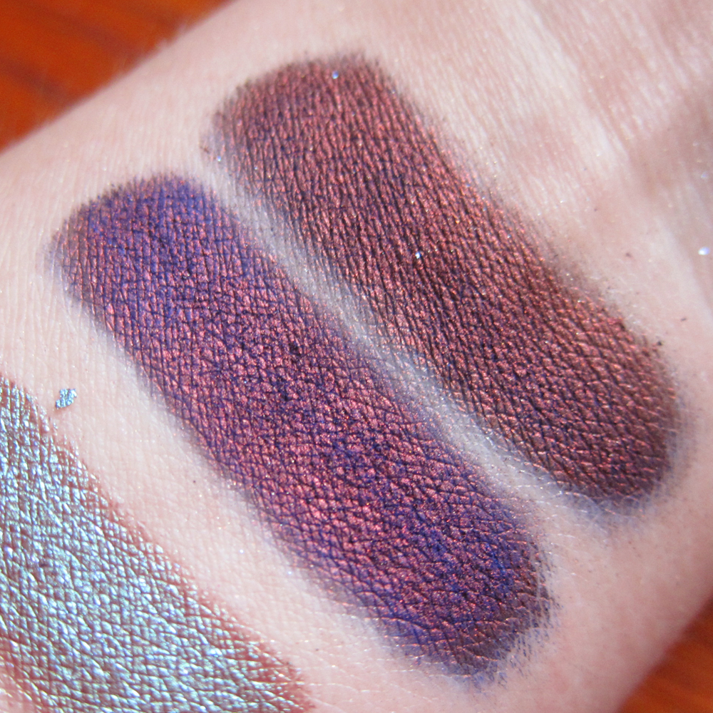
Fyrinnae – Mephisto (Original, Pressed and built up several layers)
The cobalt blue / purple is still there, but it’s taken a backseat to the copper shift. It looks quite similar to how the original looks when foiled.
So that’s my first experiment with pressing my shadows. I’m overall pretty happy with how it turned out! I know I’ll get a lot more use out of those pretty colors now. And now I can’t wait to do a second batch!

Hmm. I have a lot of loose eye shadows. I am so tired of spilling them all over the place! I have been wanting to try this for a while, and I think I might have to break down and do it. I recently ordered two Book of Shadow palettes from anothersoul on Etsy to organize my Wet N Wild trios and I really, really like them. I may get some more palettes from there and organize my Silk Naturals, Fyrrinae, Aromaleigh v1, Darling Girl, and Chic Costmetic shades.
I love indie companies, and I started pressing mine, too! 🙂 My experience hasn’t been too good with that, but I plan on just doing a better job at mixing. Great job and colors, though! I wish I could get my hands on a couple of Fyrinnae colors, but they don’t ship to where I live.
Pingback: New Darling Girl Cosmetics Swatches! |
Pingback: Femme Fatale Cosmetics Pressed Eyeshadow Experiment! | The Enchanted Mirror