UI fundamentals: Home screen, lock screen, status bar, and hubs
Home screen
Once you've set up the phone, you're greeted with the home screen. Excuse the garish orange—that's a customization by the telco that can fortunately be disabled. The home screen is one of two central components of the Windows Phone 7 user experience (the other being the lock screen), and it's a screen that has no direct analog in the two major competitors. It's the launching point for most interactions with the phone, and as such, it's a screen you're going to be using a lot. It's made up of a set of tiles. Most are square, a few are rectangular. Each tile represents a piece of information (such as a contact, a link to a webpage, a favorite song), an application, or a hub (more on these later).
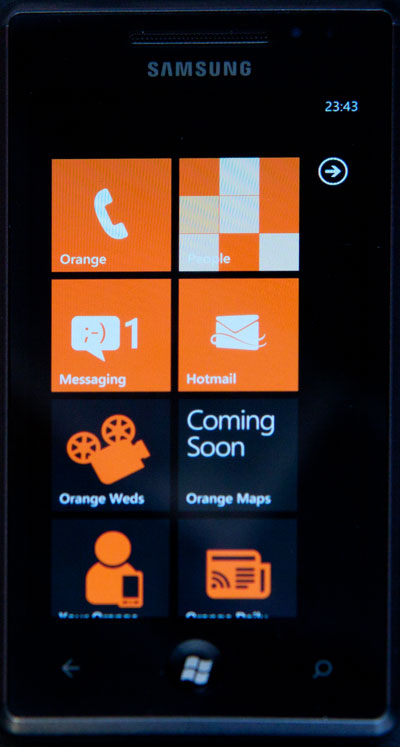
The home screen belongs very much to the user. It's mine to customize. Though there are a handful of applications preinstalled on the screen (Orange Weds, Orange Maps, and a few more besides), I can remove them simply by long-tapping them and choosing to unpin them. I can also rearrange tiles by long-tapping and dragging them around, and I can add new applications to the home screen by long-tapping them and choosing to pin them. It's my screen that I'm free to organize as I want. If I'm feeling particularly perverse, I can even remove everything on the home screen.
The home screen is the first introduction Windows Phone 7 users will have to Metro, which is the name Microsoft has given to the design and aesthetic of Windows Phone 7. The Metro name was chosen because the clear, modern signage of the kind used in airports and subway maps was the inspiration for much of the look. Instead of photorealistic, multicolored images, the operating system uses clean, stylized iconography with bold colors and crisp, beautiful text. The interface is minimal: unnecessary chrome has been stripped away in order to accentuate the information.
The styling is uncompromising. I love it. I don't know if I will still love it a year from now—I don't know if the relentless precision of it will start to grind me down—but as of right now, I think it looks fantastic, as I have since it was first shown off earlier in the year. Though clean and devoid of unnecessary clutter, it is not lifeless—the system uses a range of transition effects and animations to ensure that it remains lively and exciting. I think the Metro look makes iOS look dated, and Android cluttered and fussy. It is extremely eye-catching, and I believe will be effective at piquing people's interest in the platform. They will see Metro on an ad, or a billboard, or a friend or coworker's phone, and they will want to know more. It's something that you want to play with.
What struck me when using the phone was not simply how clean and crisp it looks, but how smooth and slick it all is. The animations and transitions are fast and fluid. With one exception (the Xbox Live Extras), I never felt that the phone was bogging down or too slow for what I was doing. Scrolling is precise, zooming is quick—it's all very snappy. The hardware spec may be high and restricted, but after using the system, it's well worth it.
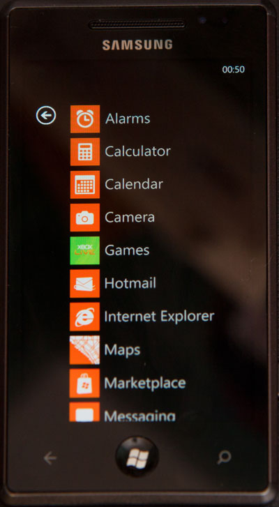
To the right of the home screen, as indicated by the little arrow, is a straightforward, alphabetized list of all the applications, both built-in and user-installed, that are on the phone. It is from here that new installations can be pinned to the home screen. This is a screen that clearly needs some love. It works pretty well at the moment, but there aren't too many applications available. When people start to load up their phones with more software, I think this screen will be a real problem. It affords no classification or categorization; it's simply a list of potentially unbounded length.
Live tiles
The tiles on the home screen are no mere dumb icons. They're live, dynamic, active components. If an e-mail account has unread mail, its tile will show an unread message count. The phone tile shows missed calls. Marketplace shows you how many upgrades you have waiting.
Tiles can do more than just show a number, of course. Pin a website and the icon becomes a miniature screenshot of the site. The calendar tile shows you the time and subject of your next appointment, obviating the need to actually open the calendar application to find that out. If you pin contacts to the home screen, their tiles will show their profile pictures and their latest status updates, so that you can keep tabs on them without having to go into any applications to do so.
reader comments
280